Photoshop for me.


Photoshop for me.
Sometimes, i like to sit on the floor, pull my knees up to my chest, wrap my arms around my legs and tuck my head in.
Why?.......Because that's how i roll.

Illustrator for me - logos have to be vector files to be used by vinyl / embroidery companies. Photoshop is for photos and it will be a pain in the arse to export this format to anything a commercial printer / embroidery company will like. It is useful for brain storming ideas quickly though.
From Factory JCW to Audi TT Quattro - Might be back one day!

Think Baz has created the best logos to date IMO
Deposit paid ... something new this way comes!

Some excellent work so far .. to me we appear to be missing the biggest thing of all
"Scotland" part in the logo. Think it should be more prominent IMO
At 8000rpm no-one hears you scream !
You only need two tools in life WD40 and Duct Tape. If it doesn't move and should use WD40 and if it moves and shouldn't use Duct Tape.

Agreed!Originally Posted by gauldrymini

MINI F56 Cooper in Deep Blue with black roof and caps.

Certainly the more generic car shape that William and Baz have suggested gives more emphasis on the text to that of the more recognisable R56. The R56 being more detailed with MINI traits could detract from the message that we are trying to get across of the web address. I’m still not fond of different colours for the text as to me it just looks to messy and will be worse under a tint.
Another quick wee play with the other outline.
Sod it, I'm getting this and just spreading the site by word of mouth
Last edited by Stewart; 24th September 2013 at 04:42 PM.
Mini as it was. As it is. As it always will be. Everyone is entitled to their opinion, it's up to you to decide if it counts!
Nice one Stewart with the outlined logos......and are you getting this for the front or rear screen...
...Haven't had much time to play around with this since last time...

Liking these Stewart, all in white, left-facing my choice - but surely it should read: THE Website for MINI Adventures?

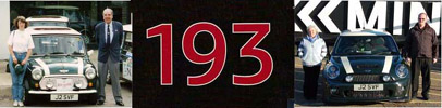
2008 R56 COOPER S, Pepper White, Black Roof, 'John Cooper' Signature Side and Bonnet Stripes, JCW 'Stage 1' Tuning Kit, Forge Intercooler, Milltek Downpipe & Sports Cat, ALTA Induction, Chris Knox/DNA Remap, JCW/Brembo Brakes, Limited Slip Diff, JCW Suspension and Front Strut Brace, 17" Crown Spokes with Non-Runflat 205/45x17 Michelin Pilot Super Sport tyres, JCW/Recaro leather Seats, JCW Sideskirts, Chili Pack, Front Spotlights. Still got my old Hendrix Badge blu-tacked to the dash!
Agree with Euan that the Mini has to be left facing. This one is still the best for me
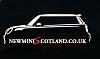

Could we not do a left and a right.......one for each back side window.....think it would look better rather than have one of them going backwards.
"I have not failed. I've just found 10,000 ways that won't work." - Thomas Edison
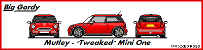
Mutley - May 2003 Chili Red 'One'
 Posting Permissions

 Reply With Quote